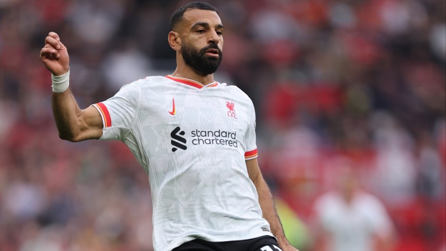
Why Nike logos are different on Premier League third kits this season with special reason behind unique detail
Third kits in the Premier League have caught the eye this season and you will certainly notice a unique difference from typical strips… Those who are sponsored by Nike usually see the famous ‘swoosh’ on the right side of their shirts, sitting horizontally and on the opposite side of the club badge. The Nike logo has been changed on Premier League third kitsGetty However, this year, Liverpool, Chelsea and Tottenham have a vertical Nike swoosh instead in what is a major change. Alongside that, there are also two swooshes with a bigger one accompanied by a smaller one on the kits. It looks a little bizarre, but there is a great reason behind the change… Why are Nike logos different on Premier League third kits? Nike have changed their logo on third kits to celebrate women’s football. They explained their switch for the 2024/25 strips in a post on Instagram announcing the release of the new shirts. “Unveiling The 2024/25 Club third kit collection, Together We Rise, built to celebrate the women’s game from grassroots to greatness,” their caption reads. They also add further detail, saying: “Intentional vertical swoosh to show the upwards rise, togetherness and acceleration of women’s football.” Liverpool then also gave some more information on what the vertical swoosh means. In their kit announcement, they stated: “Released as part of the Nike ‘Together We Rise’ collection across the brand’s club football estate, the third kit celebrates the women’s game and its acceleration in world sport. “It is uniquely represented through a distinct vertical double swoosh, which is across the jersey, shorts and matching socks.” View this post on Instagram A post shared by Nike Football (@nikefootball) Continuing to expand on the new detail, Chelsea added: “A vertical, double swoosh nods to the acceleration of the women’s game. “Two logos. Two teams. One goal. Worn by both the men’s and women’s squads, it points upward to celebrate the rise of women’s football.” Liverpool left-back Andy Robertson has given his thoughts on the new kits after featuring in the Reds’ announcement. Robertson said: “I really like it. I like the colour and the detail on the shirt, especially with the Swoosh going up, which is a bit different. Tottenham have the vertical swoosh on their green stripAFP “It’s signifying the rise of the women’s game and we’re a big part of it to try to help that.” Teams have been playing in their third kits whenever possible throughout the season and the new swooshes definitely stand out. Away from the Premier League, teams in Europe have also had the Nike tick changed on their shirts. Atletico Madrid and Inter Milan have the vertical swoosh and fans may notice that during Champions League game weeks.

Third kits in the Premier League have caught the eye this season and you will certainly notice a unique difference from typical strips…
Those who are sponsored by Nike usually see the famous ‘swoosh’ on the right side of their shirts, sitting horizontally and on the opposite side of the club badge.

However, this year, Liverpool, Chelsea and Tottenham have a vertical Nike swoosh instead in what is a major change.
Alongside that, there are also two swooshes with a bigger one accompanied by a smaller one on the kits.
It looks a little bizarre, but there is a great reason behind the change…
Why are Nike logos different on Premier League third kits?
Nike have changed their logo on third kits to celebrate women’s football.
They explained their switch for the 2024/25 strips in a post on Instagram announcing the release of the new shirts.
“Unveiling The 2024/25 Club third kit collection, Together We Rise, built to celebrate the women’s game from grassroots to greatness,” their caption reads.
They also add further detail, saying: “Intentional vertical swoosh to show the upwards rise, togetherness and acceleration of women’s football.”
Liverpool then also gave some more information on what the vertical swoosh means.
In their kit announcement, they stated: “Released as part of the Nike ‘Together We Rise’ collection across the brand’s club football estate, the third kit celebrates the women’s game and its acceleration in world sport.
“It is uniquely represented through a distinct vertical double swoosh, which is across the jersey, shorts and matching socks.”
Continuing to expand on the new detail, Chelsea added: “A vertical, double swoosh nods to the acceleration of the women’s game.
“Two logos. Two teams. One goal. Worn by both the men’s and women’s squads, it points upward to celebrate the rise of women’s football.”
Liverpool left-back Andy Robertson has given his thoughts on the new kits after featuring in the Reds’ announcement.
Robertson said: “I really like it. I like the colour and the detail on the shirt, especially with the Swoosh going up, which is a bit different.

“It’s signifying the rise of the women’s game and we’re a big part of it to try to help that.”
Teams have been playing in their third kits whenever possible throughout the season and the new swooshes definitely stand out.
Away from the Premier League, teams in Europe have also had the Nike tick changed on their shirts.
Atletico Madrid and Inter Milan have the vertical swoosh and fans may notice that during Champions League game weeks.


